logo and package design for Kararbo
Brand design for a company that produces natural cremes, serums, soaps and personal care products.
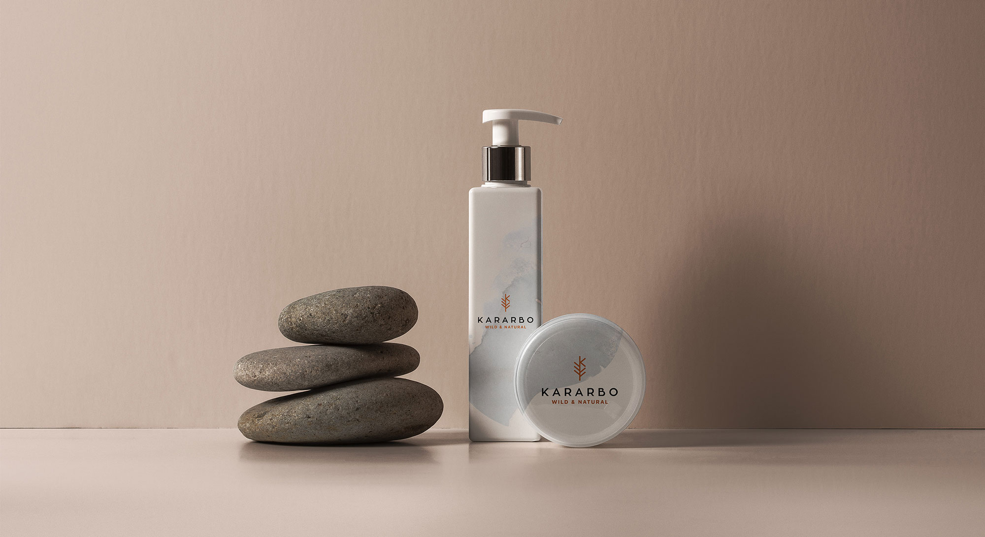
Logotype design that combines the wierd pointy leaves of the oak tree, which is mainly used for kararbo's cremes, and the first letter of the brand. Flipping one of the leaves to a mirrored possition was smooth and so matchingly perfect to do just that. That's all it took. My thought was instant, simple and it worked like a charm.
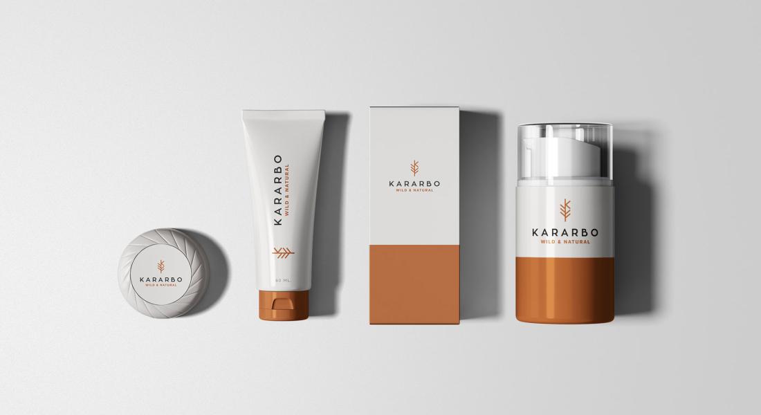
Brand design for a company that produces natural cremes, serums, soaps and personal care products.
Logotype design that combines the wierd pointy leaves of the oak tree, which is mainly used for kararbo's cremes, and the first letter of the brand. Flipping one of the leaves to a mirrored possition was smooth and so matchingly perfect to do just that. That's all it took. My thought was instant, simple and it worked like a charm.